Easy wake up with math
Year
2017
Tools Used
Adobe Xd
Adobe Illustrator
Pencil, Paper
Role
UI/UX Design
Copyrighting
Illustrations
Sleecycles is a light app designed by an insomniac designer to help people sleep better. Basically, it’s a sleep calculator that uses the alarm clock of the phone to wake up the user at the most appropriate moment, so that the person doesn’t have the usual morning tiredness or lack of energy.
A little bit of scientific facts:
One sleep cycle consists of 4 sleep stages, with an average length of 90 minutes in total.
Stage 1: 20 minutes of superficial sleep in which your body temperature, heart rate, breathing rate, and energy use decrease.
Stage 2: 65 minutes of profound sleep in which your body rests and recovers
Stage 3: The REM (rapid eye movement sleep) in which we dream
Stage 4: 5 minutes of non-REM sleep
For a better illustration of the process, let’s suppose I want to wake up at 08.00. The app would calculate the best time to go to sleep, so you feel refreshed and not groggy in the morning.
The math is simple: from 08:00 we subtract 15 minutes(average time for a person to fall asleep) and then 90 minutes (for each sleep cycle). To wake up fresh you would have to go to sleep at one of these hours: 21:50, 23:20, 12:50, 2:20, 3:50 or 5:20.
Easy, huh?
Now let’s go through the designing process.
UX
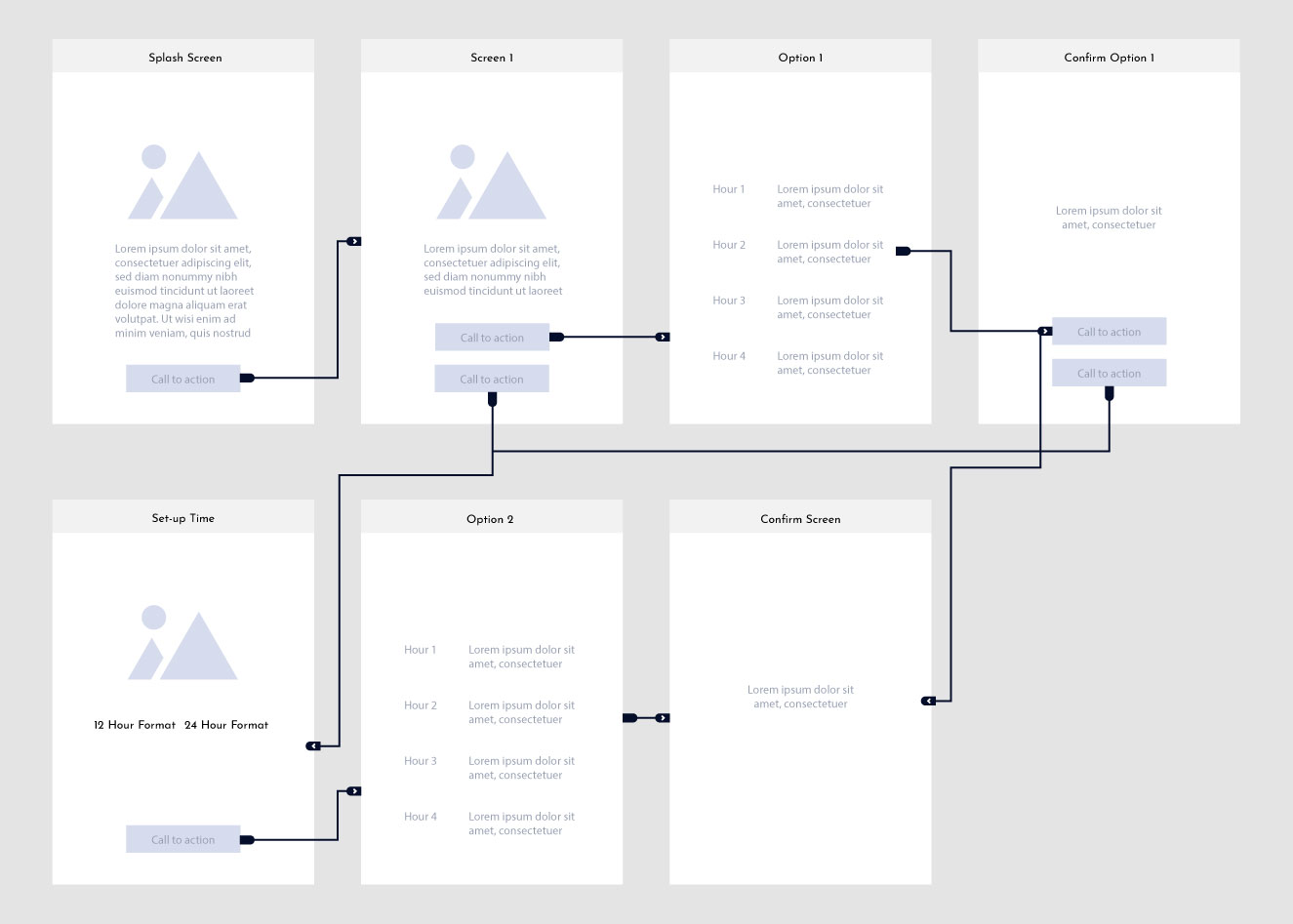
The first idea when designing the app was to keep it simple and as straight-forward as possible. Nobody wants to spend 10 minutes to set up an alarm before going to sleep. As you can see, the app will have an informative screen that is displayed only once at the beginning (lots of people, including me, install applications without knowing what are they about), so the first, info screen, tells what is this app about and how it calculates the wake-up time.
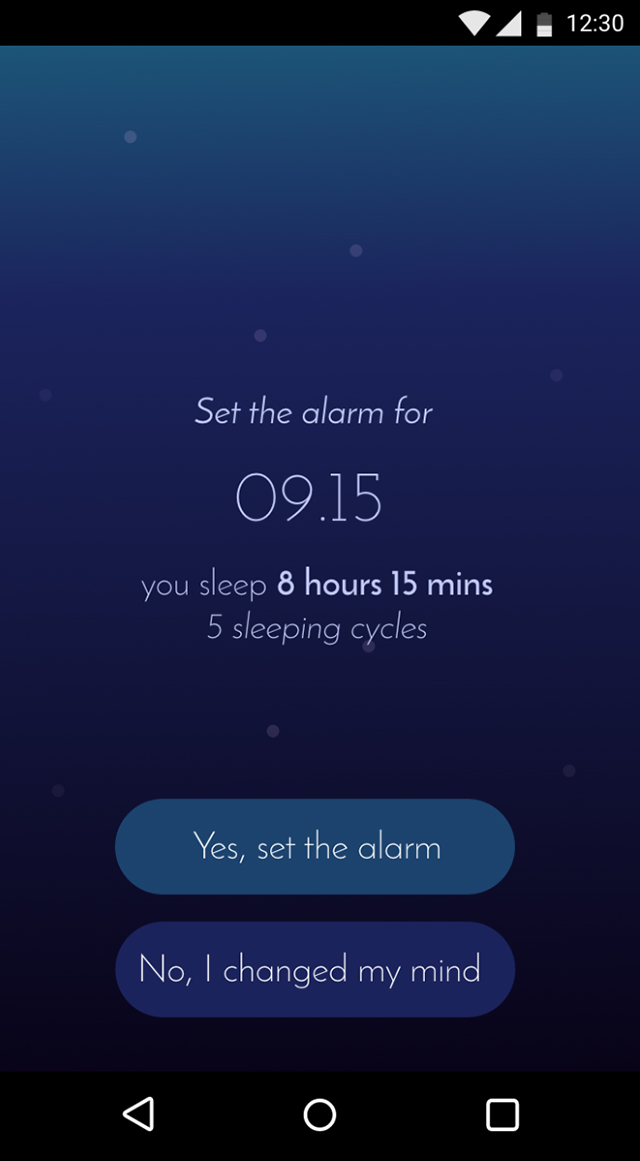
The following screen let´s you pick from two options: when you should wake up if you go to sleep now and when you should wake up if you go to sleep later.
UI
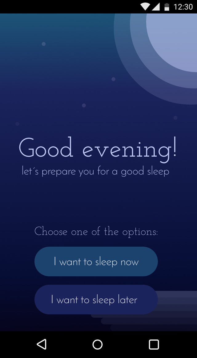
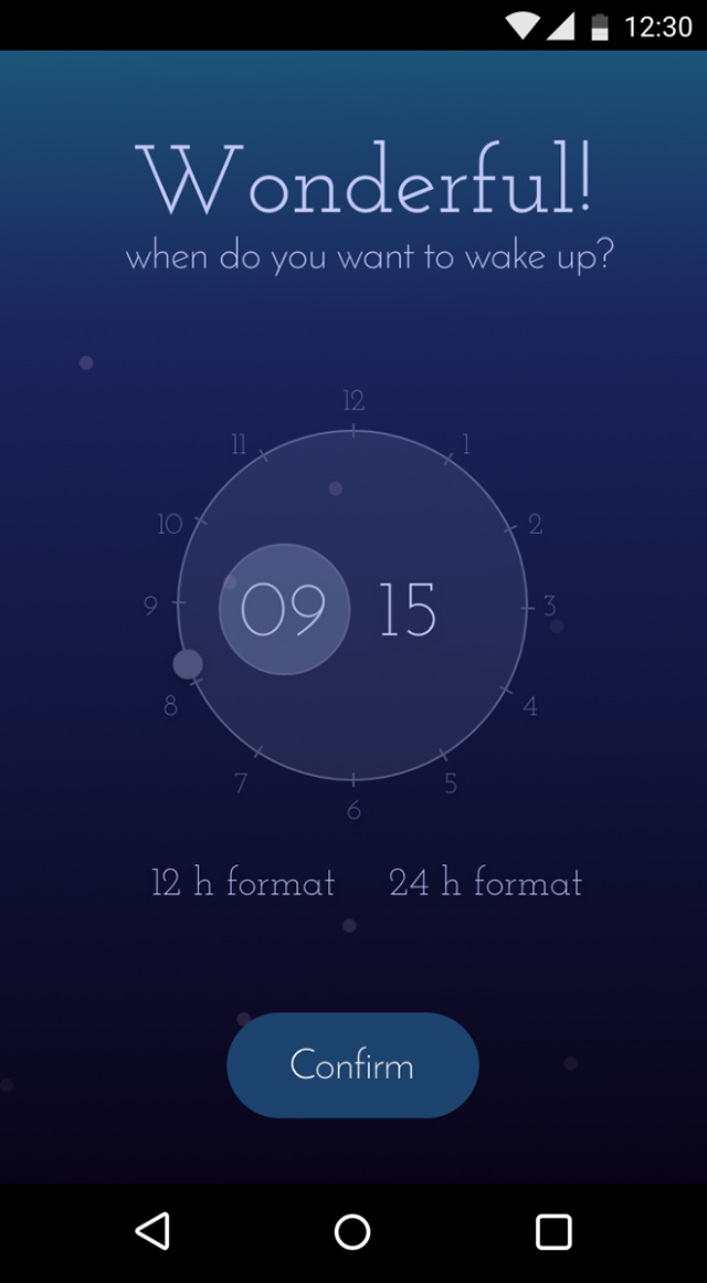
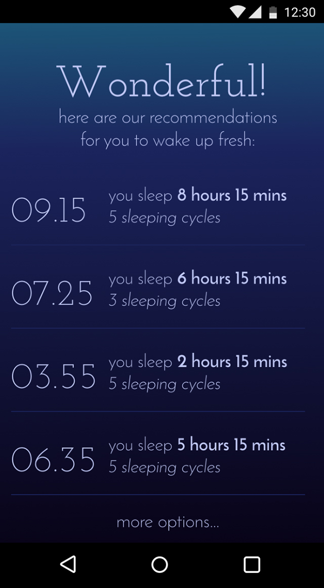
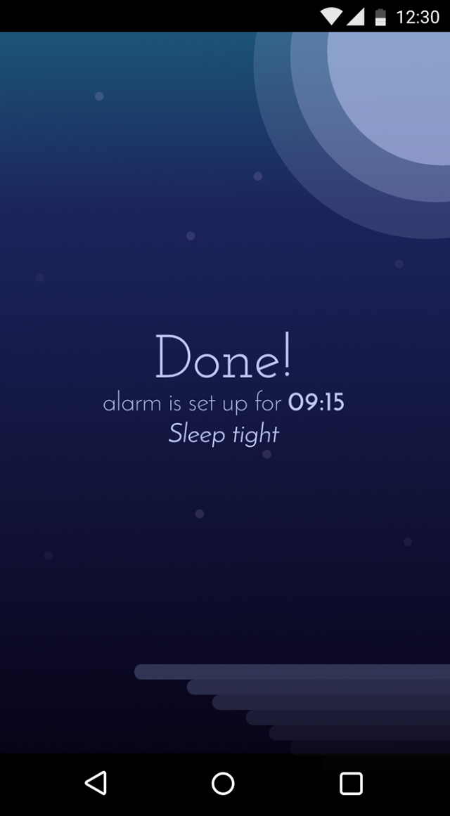
I went with a gradient inspired by a moonlight sky, with a dreamy light font (a combination of Josefin Slab for headlines and Josefin sans for the text and buttons). Because the majority of people remember to set up the alarm usually in bed, right before going to sleep, in dark (with light off), I used pale colors so that they don´t get blinded by the intense light of the phone screen, while using the app.
I tried to keep the app minimalistic, so only used simple shapes for moon and waves (reflection) and smoothed button corners. In the end, people prepare for going to sleep, don´t they?
A B C D E F G H I J K L M N O P Q R S T U V W X Y Z a b c d e f g h i j k l m n o p q r s t u v w x y z
Headings – Josefin Slab
A B C D E F G H I J K L M N O P Q R S T U V W X Y Z a b c d e f g h i j k l m n o p q r s t u v w x y z
Paragraph – Josefin Sans

If you want to have a live preview, click here. (Adobe xd website)
Music I listened to: Pearl Jam unplugged
Browse more projects